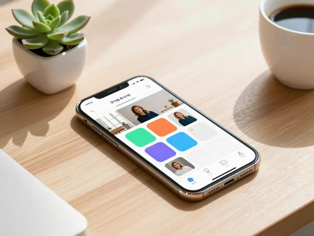
Gone are the days when building a professional-looking website required a coding degree or a hefty monthly budget. In 2026, the power to create a stunning, mobile-first online presence sits right in your pocket—thanks to a new wave of intuitive, free builders. Whether you’re launching a side hustle, a portfolio, or a passion project, this guide cuts through the noise to reveal the seven best free mobile website builders. Each one makes beginners look like seasoned pros. You’ll walk away with a clear, practical breakdown of every tool’s strengths and limitations, plus the exact pick for your specific goals. No tech skills required.
What Beginners Actually Need From a Free Mobile Website Builder
The Core Requirements for a First Website
Building your first site from your phone? The bar for “good” is surprisingly low—but the non-negotiables are few and exact. You need a drag-and-drop editor that truly works on a tablet or handset, not a desktop tool that just happens to load on mobile. Tap, hold, and move text blocks, images, and buttons without pinching or zooming. Next, your builder must include pre-designed templates that adapt automatically to any screen. The same layout should look clean on a 6-inch phone and a 13-inch laptop, with no broken margins or overlapping text. Sign-up should be email-only—no credit card, no trial that quietly flips into a paid plan. You’ll also want a free subdomain (like yourname.builder.com) so your site goes live the second you hit “publish.” Finally, watch for upgrade prompts that don’t block basic publishing. A banner saying “Upgrade to remove ads” is fine; a pop-up that demands payment before you can share your URL is a dealbreaker. Miss any of these five, and a builder isn’t beginner-friendly—it’s a marketing funnel wearing a disguise.
Why Mobile-First Design Matters More Than Ever in 2026
These days, every major free builder defaults to mobile-responsive templates. Your layout, text, and images shrink and reflow to fit smartphones automatically. That’s essential, since most visitors will arrive from a mobile device, and search engines prioritize mobile-friendly pages. But “responsive” goes beyond shrinking. It’s about tap targets. A solid builder in 2026 enlarges buttons to at least 48 pixels wide, boosts line spacing for readability, and hides non-essential elements—like big header images—on small screens. You shouldn’t have to tweak a thing; the template does the heavy lifting. Expect a preview mode that shows your site on three or four common phone models. If that preview looks broken, move on. For a beginner, mobile perfection should be the default, not a buried setting. The best free tools cost nothing upfront, with optional paid tiers from roughly $4 to $15 per month if you later want a custom domain or advanced analytics. But you can absolutely launch and maintain a polished site for free.
Comparing the Top Free Builders: Wix, Weebly, Google Sites, and WordPress.com
Side-by-Side Free Plan Limits in 2026
Before you invest hours into building your first site, you need to know exactly what each free tier provides—because the differences are stark. Wix gives you 500 MB of storage and 1 GB of bandwidth per month. That’s fine for a small portfolio, but it will struggle if you embed many high-res photos. You’ll also see Wix branding in the footer, and your address will be a subdomain (yourname.wixsite.com). Weebly matches Wix with 500 MB storage and no explicit bandwidth cap, but it also places Weebly ads on your pages and assigns yourname.weebly.com. Google Sites stands apart: unlimited storage and bandwidth, zero ads, and a clean subdomain (sites.google.com/view/yourname). The trade-off is that its design tools are intentionally sparse. WordPress.com offers 1 GB of storage—double Wix and Weebly—with no bandwidth cap, but it shows WordPress ads and uses yourname.wordpress.com. A critical 2026 note: none of these plans allow you to connect a custom domain without upgrading to a paid tier, which typically costs between €4 and €12 per month depending on the platform and billing cycle.
The Easiest Choice for Absolute Beginners
If you’ve never built a website, two names consistently top every 2026 beginner review: Wix and Google Sites. Wix remains the gold standard for pure ease because its drag-and-drop editor is genuinely intuitive—you click, drag, and everything snaps into place. You get hundreds of free templates that look professionally designed out of the box, so you never touch code. The learning curve is about 20 minutes, and the visual feedback is instant. The downside? You must stay mindful of that 500 MB storage, and the free ads can feel a bit loud. Google Sites, on the other hand, is almost too simple—it feels like editing a Google Doc. You pick a layout, add text, images, and embed YouTube videos or Google Maps with zero friction. Since storage and bandwidth are unlimited, you never worry about hitting a limit. The real cost is design flexibility: you’re stuck with a blocky, template-driven structure that lacks Wix’s polish. For a personal resume, a family photo page, or a small hobby project, Google Sites is the fastest path from zero to published. For anything where visual impact matters—a freelance portfolio, a small business landing page—choose Wix and accept the storage ceiling. Both are excellent, but they address different fears: Wix solves the fear of “it won’t look good,” while Google Sites solves the fear of “I’ll break something.”
Setting Up Your Account and First Page Without Getting Stuck
Email Sign-Up and Avoiding Upgrade Traps
Every free mobile website builder in 2026 asks for the same thing to get started: a valid email address. That’s it. No credit card, no phone verification, no “trial period” that silently converts to a paid plan. You’ll be in and editing within three minutes. But here’s where beginners get snagged: the upgrade prompts. They appear almost immediately—a bright banner suggesting you unlock custom domains, a pop-up offering to remove the builder’s watermark, a sidebar nudging you toward “Pro” features. None of these are urgent. You do not need a custom domain to test your idea, and the watermark is irrelevant while you’re learning. When the prompt appears, look for the small, grey text that says “Stay on Free” or “Maybe Later.” Click it. Every time. Do not feel pressured by countdown timers or “limited-time 50% off” messages—those are marketing tactics, not deadlines. Once you’ve built something you genuinely like and understand what features you actually miss, you can upgrade on your own terms. Until then, your free account is fully functional.
Choosing a Template That Looks Professional on a Phone
Pick a template labeled “mobile-optimized” or “responsive” in the builder’s gallery. Preview it on your actual phone before committing. Avoid templates with heavy sidebars or multi-column layouts that may feel cramped on a small screen.
This is the single most important decision you’ll make in your first session. A template that looks stunning on a desktop monitor can look like a cluttered mess on a 6-inch screen. Most builders now filter templates by “mobile-first” or “responsive” tags—use those filters unapologetically. But don’t trust the thumbnail alone. After you select a template, hit the preview button and switch to the mobile view icon (usually a small phone silhouette). Better yet, publish your draft immediately and open the live URL on your actual phone. Walk through the homepage, a text-heavy page, and a gallery page. Does the text reflow cleanly? Are buttons thumb-sized? Is there awkward white space? If yes, go back and choose another template. In 2026, the best free builders—like Google Site’s refreshed editor, Wix’s free tier, and Framer’s basic plan—all offer genuinely responsive templates that adapt automatically. Stick to single-column layouts with large tap targets. Avoid anything with a fixed sidebar, multiple columns, or heavy horizontal scrolling. Your phone is the primary device for most visitors in 2026, so if it doesn’t look right there, it doesn’t look right anywhere. Most builders let you switch templates later without losing your content, so don’t overthink it—just pick a clean, single-column option and start moving.
Building Your First Page: Text, Images, and Layout Basics
Drag-and-Drop Editing on a Smartphone Screen
The core promise of a beginner-friendly mobile builder in 2026? You never touch a line of code. Instead, you work directly on a live preview of your page. Most modern builders—whether you’re using a dedicated iOS or Android app or a responsive browser tab—let you tap, hold, and drag elements like text boxes, images, and buttons into place. But resist the urge to overstuff your first page. Mobile users scroll fast, so your layout should match that pace. Aim for a single, punchy headline that states your value proposition, one short paragraph (two to three sentences max) explaining what you offer, and one clear call-to-action button—something like “Book Now,” “Shop the Sale,” or “Get a Free Quote.” Place that button above the fold if you can, and give it a contrasting color so it’s the first thing a thumb can reach. As you drag, watch for the grid or alignment guides that appear on screen; they snap elements into place, preventing awkward gaps or overlapping text.
Adding a Contact Form and Social Links
Your page isn’t a finished storefront until visitors have a way to reach you. Fortunately, every serious mobile builder in 2026 includes a built-in contact form widget—no custom scripting required. Drag it onto your page, then tap each field (name, email, message) to edit it. Keep it short; a three-field form converts better than a ten-field marathon. Next, link your social media profiles using simple URL fields in the builder’s settings panel—these usually auto-generate recognizable icons. If you have a physical location, add a map widget by pasting your address; the builder will embed an interactive map users can tap to open in their own navigation app. Finally, the most critical step: test the form on your actual phone. Fill it out, hit submit, and confirm you receive the notification email or a confirmation message in your builder’s dashboard. Many beginners skip this and later discover broken submissions. A quick two-minute test saves you from losing real leads. For pricing, expect free tiers to cover all these basics indefinitely, with premium plans (for custom domains or removing builder branding) ranging from roughly $4 to $15 per month—well within reach as you grow.
Handling Branding, Ads, and Subdomains on Free Plans
Why Every Free Site Shows the Builder’s Badge
In 2026, every free plan from the major mobile builders—Wix, Weebly, or Site123—places a small banner or badge somewhere on your live site. It usually sits in the footer as “Made with Wix” or “Powered by Weebly,” and on a few platforms, it may also appear in the mobile preview bar. Removing it requires a paid tier. This isn’t a glitch; it’s the core business model. The builder gives you hosting, SSL, and a drag-and-drop editor for free. In exchange, they get thousands of tiny billboards across the web. For a beginner, that’s a fair trade-off: you save €10 to €15 per month on hosting, and the badge often looks professional enough that casual visitors won’t notice it. Watch out, though, for builders that inject third-party ads inside your content area. Most reputable ones—including Wix, Weebly, and Google Sites—don’t do this in 2026; they only show their own badge. But if you pick a lesser-known free builder, read the fine print. Some insert pop-up ads or redirect links on mobile, which will absolutely destroy your user experience. Stick to the big names, and the badge is the only branding you’ll see.
Subdomain Limitations and When to Upgrade
Your free site won’t live at yourname.com. Instead, it’s parked on a subdomain like yourname.wixsite.com or yourname.weebly.com. That’s a hard limitation across all free plans in 2026. For a personal portfolio, a family recipe blog, or a hobby project, this is completely fine—you lose no functionality and can share the link freely. But the moment you want to look credible to potential clients, employers, or customers, a subdomain screams “amateur.” If you’re building a freelance photography portfolio to land paid gigs, or a small business site to collect leads, budget for a custom domain. The good news? You don’t need to upgrade the whole builder plan just to get one. You can buy a domain separately (from €8 to €15 per year) and, on most builders, connect it to your free plan—though the badge remains. To remove the badge and get a custom domain, you’ll need a paid plan, typically €9 to €25 per month depending on the builder and features. For a true beginner testing the waters, stick with the subdomain. The moment you start pitching your site to anyone outside friends and family, upgrade. That’s the line.
Customizing Design Without Coding: Fonts, Colors, and Layouts
Using Built-In Theme Editors
Every serious free builder in 2026 ships with a visual theme editor that puts design control squarely in your hands—no CSS required. You’ll find sliders for spacing, color pickers for backgrounds and text, and dropdown menus for font pairings. The key to looking professional isn’t using every option; it’s restraint. Pick two or three colors from your brand or logo, and stick to one or two font families—say, a clean sans-serif for headings and a readable serif for body text. Most editors also let you adjust line height and letter spacing, which instantly makes blocks of text feel airy and intentional. Before you publish, test your palette on a mobile screen: high-contrast text (dark gray on white, for example) beats pure black-on-white for readability, and avoid neon accents unless your brand is deliberately loud. A good rule of thumb is to preview your site in the editor’s mobile toggle, then tweak padding until buttons are at least 44 pixels tall—the standard thumb-friendly size.
The Limits of Google Sites vs. Wix and Weebly
Here’s where beginners often get tripped up. Google Sites, the most constrained free builder, allows only basic layout changes—you can rearrange sections in a fixed grid, swap header images, and change fonts, but you cannot freely position elements or overlap them. That sounds limiting, but it’s actually a safety net. Wix and Weebly, by contrast, offer drag-and-drop freedom: you can place a text box anywhere, resize images by hand, and layer elements. That freedom is a double-edged sword. Without a design eye, you’ll end up with misaligned buttons, awkward gaps, and a page that looks chaotic on a phone.
Google Sites allows only basic layout changes—you can’t freely position elements. Wix and Weebly let you drag anything anywhere, but that freedom can lead to messy designs if you’re not careful. For beginners, Google Sites’ constraints actually prevent mistakes.
So, if you’re a true beginner, start with Google Sites. Use its built-in themes to set a consistent color scheme, then adjust only the font size and spacing sliders. If you prefer Wix or Weebly, impose your own rules: keep a consistent margin around all elements, align everything to a 12-column grid, and never place two interactive elements closer than 16 pixels apart. The best design system in 2026 is the one you can actually maintain without frustration—and for most newcomers, that’s the one with guardrails built in.
Publishing Your Site and Testing It on Real Devices
The Final Steps Before Going Live
You’ve arranged your blocks, tweaked your fonts, and picked a palette that doesn’t scream “template.” Resist the urge to overthink. Hit “Publish.” In 2026, every serious free builder—think Wix, Webnode, or Site123—will instantly hand you a free subdomain (like yourname.builder.com) and serve your site over HTTPS. That’s it. You’re live.
But the real work starts now. Pull out your own phone first. Open the site in Safari or Chrome—not the builder’s in-app preview. Scroll every page slowly. Check that buttons aren’t overlapping, that text wraps cleanly without orphaned words, and that your hero image doesn’t take five seconds to load on 4G. Then send the link to two friends: one on an older Android, one on a small iPhone SE. Ask for screenshots. Grab a tablet if you can; landscape mode on a 10-inch screen will expose layout gaps you never saw in the desktop editor. If anything looks broken, edit, re-publish, and re-test. This loop takes 15 minutes. It’s the difference between looking like a pro and looking like you clicked “generate” and walked away.
Common Mistakes to Avoid on Your First Publish
- Forgetting to preview in mobile mode before publishing. The desktop editor lies to you. Always toggle the mobile icon (usually a phone silhouette) in the top bar before you hit publish—not after. In 2026, most free builders let you swipe between breakpoints. Do that for every page, not just the homepage.
- Using images that are too large. A 5MB photo from your DSLR will crush your load time. Compress images to under 300KB using a free tool like TinyPNG or the builder’s built-in optimizer. Aim for a total page weight under 2MB. If your hero image is still heavy, crop it to 1200px wide—that’s plenty for any phone screen.
- Adding too many pages before the site is polished. Beginners often build 10 pages, then publish a half-finished mess. Start with three: Home, About, and Contact. You can add a blog or portfolio later. A clean, small site beats a sprawling, broken one every time.
- Ignoring the builder’s built-in SEO settings. On the free tier, you still get basic fields for page title and meta description. Fill them out: 60 characters for the title, 155 for the description. Use your real keywords (e.g., “handmade ceramic mugs in Lisbon”), not generic phrases. This is free traffic you’re leaving on the table.
Advanced Considerations for Growing Beyond a Free Plan
The free tier of any mobile website builder is a fantastic sandbox, but it has a ceiling. Recognizing when you’ve hit it—and planning your escape route—separates a hobbyist from a serious site owner.
When to Move to a Paid Plan or Another Platform
Your first trigger is functional lock-in. Need third-party plugins like a booking system or advanced analytics? Want custom CSS for a unique brand feel? Or just a simple custom domain without a “.wixsite.com” or “.weebly.com” suffix? The free tier will actively fight you. On WordPress.com’s free plan, for instance, you cannot upload plugins or modify the underlying code—those features sit behind a paid subscription ranging from $4 to $45 per month, depending on the business tier. Wix and Weebly similarly reserve ad removal, extra storage, and e-commerce for premium plans, typically $10 to $30 per month. The moment you start calculating workarounds, it’s time to pay or migrate. For serious growth—hundreds of products or heavy SEO competition—a self-hosted solution like WordPress.org (where you pay only for hosting, roughly $3 to $15 per month) offers unlimited plugins and full code control. The rule of thumb: if you’re spending more time fighting restrictions than creating content, jump ship.
Backup and Export Options on Free Builders
Before investing hours into any free builder, run a simple test: try to leave. This is the single most overlooked trap. Google Sites and Wix are the most generous—they let you download your entire site’s content as a file (HTML or XML) and migrate it elsewhere with relative ease. Weebly, however, historically restricts full exports; you can copy text manually, but you’ll likely lose your layout and image associations. WordPress.com’s free tier offers an XML export, but it strips out media files unless you download each image individually. My advice: keep a local folder on your computer or cloud drive with every image, logo, and text block you publish—from day one. Also, check whether the free builder auto-saves a backup to your device or only to its cloud; if the latter, a service outage or account suspension could mean total loss. Most mobile builders in 2026 now offer one-click “content download” buttons, but don’t assume—verify it in settings before you commit. A site you can’t export isn’t really yours; it’s a rental with a very strict landlord.
Choosing the right free mobile website builder in 2026 isn’t about flashy templates. It’s about how fast you can publish a clean, responsive site without writing a line of code. For absolute beginners, Carrd remains the standout choice—its editor has zero learning curve, and the mobile-first preview keeps things simple. If you want no ads and smooth integration with your existing Google account, Google Sites is your safest bet. The takeaway? Pick a free tier that lets you publish immediately, then upgrade only when you need a custom domain or advanced analytics. Your next move: choose one builder from this list, create an account, and launch a one-page version of your idea today. Within an hour, you’ll have a live URL to share. The best tool is the one you actually use—so stop comparing and start building.